Reflecting back on my original rationale; I don’t feel I have made the most out of this module or pushed myself to produce the standard of work that I am capable of. I feel I have touched upon the areas that I wanted to focus on, but I haven’t exploited them to a very high level. Out of all the modules I have done throughout the course so far, I have definitely struggled most with this one for various reasons.
My intention was focus on illustration and type as image. I have produced work that covers both of these areas but looking back at the work, I haven’t produced the sort of type as image that I wanted to work with; I wanted to work more with the sort of hand crafted/rendered type that I began working with towards the end of my second year but I didn’t manage to appropriately fit this into a brief; obviously, this is completely my own fault. I think the cause of this has been my poor time management as I picked up a couple of briefs along the way and I got caught up in these ones and due to lack of time, I chose to drop the Lyrics and Type brief which would have been the substantial brief where I really focused on hand crafted typography.
Another area that I wanted to address was my software skills in photoshop and illustrator. In particular I wanted to really get to grips with the basics of them both; I obviously had quite a good understanding of both pieces of software due to workshops etc. over the past couple of years, however they were both quite time consuming and I could never estimate the length of time I would spend on them very well, meaning it would effect my time management. Therefore, a positive is that I feel more comfortable using these pieces of software at a more efficient rate.
I think most of my briefs reflect my design intentions relatively well i.e. in terms of what I want to focus more on, but there were some that I really dwelled on, so much so that in the end I wasn’t happy with the what I produced and I think some of the work may reflect that. For example, the Criminal Damage brief; at the start, I intended for this to be a lot more illustration orientated but I chose to develop the metal band inspired type aspect. In the end, I wasn’t happy with every design that I pursued and I definitely feel that this brief could have been turned around a lot quicker.
As mentioned previously, I have really struggled with this module and I feel it was partly to do with the fact that I was trying to do all 6 briefs at the same time. Looking back, I should have set stricter deadlines for myself and maybe just have done two at a time and properly complete these before starting another. I actually think if I did this, I would have produced more work and work of a higher quality. My overall feel for this module was that I panicked quite a lot and focused more on quantity rather than quality - so I ended up not having time to do a lot of things such as quality printing.
Overall, for my Final Major Project, I really hope that I can learn from the mistakes I have made throughout this module. I need to make stricter decisions on the briefs that I want to undertake, why I want to do them and what I want to get out of them so that I can’t completely change my mind when I start panicking and end up producing work that I am unhappy with and don’t want to put in my portfolio.

Mock up Gallery
As I, unfortunately, don't have an empty gallery to hang any prints....I chose to mock one up as well as I could.


The cards at the bottom are a mock up of what they Could look like as a set, possibly sold at the exhibition.


The cards at the bottom are a mock up of what they Could look like as a set, possibly sold at the exhibition.
Pens in colour...
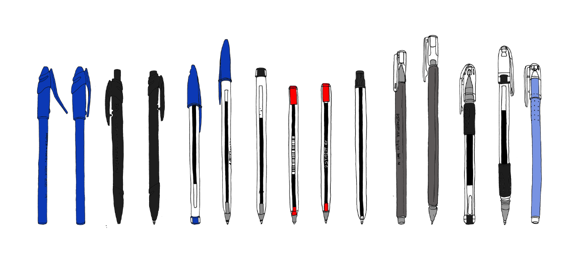
The more I look at this the more I like it...On first impression I really didn't think it worked, or was visually engaging but the more I see it, the more I think it is visually engaging and it indentifies the brands of some of th ebrands (unintentionally).
However, firs impressions count and my first impression wasn't great.
Final proposed prints
I chose to use the texture/pattern from the inside of an envelope as the background. This isn't because it has any particular relevance to post, so to speak. It is to make it look less flat.
Pen type?

I tried quickly making type out of my drawings to see how it would look...
I actually wish I had factored this into the brief so that I could hav given myself time to produce it at a higher quality and give me an interesting typeface print for my portfolio. Alas, I didn't factor the time in for it but it is something i could develop in the future.
Vectors
I tried quickly vectorising some of the pens to see if this would 'add anything'.
I really don't think it did, if anything it made them look worse.
I feel that the hand drawn quality is a strong point of this brief so far.

I really don't think it did, if anything it made them look worse.
I feel that the hand drawn quality is a strong point of this brief so far.

Layout/Textures
I wanted to experiment with the curved/round layout.
The main issue with these were the scales of the pens - it was important for me to maintain the scales of the pens to differentiate them but when it came to producing the round layouts, they looked a little odd therefore I don't think I will be developing them any further.
As I can't produce foil prints due to time restraints and problems with size (i.e. when the prints are scaled down to a suitable size for foiling - they line quality is even thinner which the foil doesn't always pick up very well.) I didn't want the prints to be on flat white stock so I wanted to find a texture that could work on the background.
150 pens...
Working with 150 pens all on one image...all scanned in at 300dpi...wasn't the easiest process! It was time consuming to say the least!...but I'm really happy with the outcomes.
I definately think its visually engaging when you realise that every drawing is different - not one is repeated.


I definately think its visually engaging when you realise that every drawing is different - not one is repeated.


Click on the image below!
Its a long print of all 150 pens - due to the sizing constraints when you upload to blogger, it just looks like a bit of a tiny blur at this scale but I think it could work quite well if it was to be an interactive border or something.
Its a long print of all 150 pens - due to the sizing constraints when you upload to blogger, it just looks like a bit of a tiny blur at this scale but I think it could work quite well if it was to be an interactive border or something.


These last ones were to try and mock up what foil prints could look like...it just doesn't have the same effect and I wish i could have physically done them.
Pen sketchbook
I have previously posted 104 pens that I drew...this is sketchbook showing all the pens I have drawn up to this point.
Although these are images that I will pursue for this particular brief, I do actually think I will carry on drawing more and more of them because there is lots of spac left in the book so I don't really have an excuse! It will probably just be something I do in my spare time.
Although these are images that I will pursue for this particular brief, I do actually think I will carry on drawing more and more of them because there is lots of spac left in the book so I don't really have an excuse! It will probably just be something I do in my spare time.


Mixtape purse
Once again, my mum sewed up the final purse and this one works a lot better than the original one I produced.
The 'flap' works aswell!
Also, its really quite small but you can actually read the 'I heart mixtape' on the tiny little tag which I didn't expect! So that is a positive.


The 'flap' works aswell!
Also, its really quite small but you can actually read the 'I heart mixtape' on the tiny little tag which I didn't expect! So that is a positive.


Subscribe to:
Posts (Atom)