Braces are good because:
they challenge the stereotype that Americans
believe; 'all' British people have bad teeth.

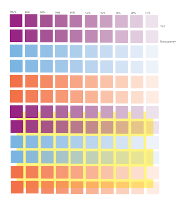
 It is quite a quick example but I think it shows how you can uses tints and transparents to create more colours and save money. Plus, I think it looks nice :)


 The layout of this one is the same as the previous one but by changing the position of the words and weight, It seems to make it more successful.

 I feel that the re-do of the word not only looks better, but is also a better reflection of my style of work. Still, both words are relevant to my summer.
 When we did the presentation I was told that my other Motown logo looked just liked the Norwich Union logo...off the top of my head, I had no idea what that looked liked, but I figured it wasn't a good thing! I thought about it more and reverted back to the 'style' of my initial ideas for the logo. I wanted to create something that wouldn't look out of place on a t-shirt, cd or a website but it also needed to look....better?
 Edit 29th October: I went to see a Motown show last night called 'Dancing on the Streets', and the majority of the lighting was purple and turquoise/aqua blue (I never know what to call that colour), So needless to say, I was happy with my colour choices!
 The pictogram that I created for "Picking Rasberries" was my personal favourite, I feel the placement on the page along with the line weight etc. make it visually interesting but it also conveys the message clearly.
