
Negotiated Brief - 'Glitter mixed with rock & roll'

Lady Gaga - Boys boys boys
'Hey there sugar baby
Saw you twice at the pop show
You taste just like glitter mixed with rock and roll'

I didn't pursue various ideas for this lyric because I kind of had one idea and wanted to go with it, thankfully...(in my opinion) it has worked.


* Glitter is ridiculously hard to work with.
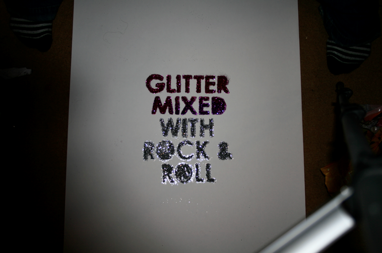


Below is the final piece; if there was one thing I could change it would be the greyish cross dividing the pictures but this was because of how it was photographed.

Negotiated Brief - 'Rich and Famous'

Lady Gaga - The Fame
'Doin' it for the
Fame (fame!)
Cuz we wanna live the life of the rich and famous'

My intention for this first idea was to use the same technique as the moving image brief; cut it out of black card and photograph on a lightbox, but my lightbox isn't as powerful as I thought so it didn't really have the intented effect...


So I moved on...

For this, I wanted to make it look kind of like a cheesy logo.


Once I had vectorised my hand drawn piece, I wasn't sure what I wanted to do with it.
I wanted it to look cheesy and expensive...so kind of 'tacky' but again, wasn't sure how I could do that. Then I saw one of those horrible ringtone adverts '£4.50 a week for bla bla on your phone!' and there was gold 'Bling' or something on the ad, so I thought 'Well...they made the text look gold so maybe I could?'

I then found a tutorial on how to do it and I'm surprisingly with the end result. Nice and tacky.
(Note the added sparkles for the extra wow factor lol.)


Below is the final piece, the glow in the background hasn't shown up on the final print...not sure why.

Negotiated Brief - 'Retro Glamour'

Lady Gaga - The Fame.
'Give me something
I wanna be, retro glamour, Hollywood
Yes we live for the'

As this is only 2 words, my intention was for the final resolution to be bold and eyecatching.
I tried a few different typefaces and layouts...


I liked the above example, but I felt the one above that had a more 'retro' feel too it.
I then copied that, added a 3D look to it and then vectorised my hand rendered piece.


I really like the following piece but I'm not sure it would be totally readable if somebody didn't know what it actually said in the first place.

I printed the following piece A2 with the intention of adding gem/rhinestone/sparkly things too it...
...however, once I printed it out, I realised it wasn't really going to wokr because the gems didn't fit exactly in the blacked out area or the 3D area so it would look quite messy...so I ended up using it as a size reference and just stuck the gems on plain white paper.

Below are smaller mock ups that I did before the final to make sure it would work.


Negotiated Brief - 'Russian roulette is not the same without a gun'

Lady Gaga - Poker face
'Russian Roulette is not the same without a gun,
And baby when it's love if its not rough it isn't fun'

As I noted in my primary research, blood was one of the things that Lady Gaga uses as a visual aid and I thought...what better lyric to use blood with?
Although it can be seen as macarbe and...gross? I am really happy with how this piece turned out, I would say that it is my favourite one.


After deciding on the type and layout that I would use, I traced the type onto white paper but instead of drawing it out with a pen/pencil, I used candle wax so you couldn't actually see it (yes, I was inspired by primary school techniques.)
Once I completed that...I dripped red paint down it, to reveal the type.

The intention is basically for it to look like...somebody lost as russian roulette.


Below is the final image that I printed.

Very 'me'