Tissue box mock up

Another example of how the type could translate to packaging - again, I have used the initial drawings show how it will look.

Evidently with these, I have somewhat decided that I want to use just one colour with different tints, but within the crit I still want to know if the majority think this is successful.



5 Questions for crit.

1) Do you think the style of illustration/type is appropriate to a males audience?

2) Does the language/humour work?

3) Do you think I should use a variety of colours - or have a limited colour pallette?

4) Could you suggest any ideas for the background instead of it just being a block colour? (or more specifically, just being white.)

5) I have addressed a few potential places for distribution (i.e. adshells, billboards etc). Are there any more that you think may be appropriate?

Context...

The print contexts that I intend to present my work in are as follows;
- The type on the packaging. (Handy packs, tissues boxes, kitchen roll/toilet roll packaging)
- Billboards, adshels.
- Mailshot, Ads (magazines etc.)

I addressed some digital routes that I hope to explore on my statement of intent - these may change as my work develops.

(Example of how the type as image could translate to ads;)

Colour...

At first I just assumed I would use a range of colours, but after thinking more about it - as I am using type as image/hand rendered type, the range may end up looking quite different but a limited colour pallette could create a link between them all?


I'll have to play around with them more.

Mock up on packaging...

As mentioned in an earlier post, the frame that I drew my visuals in were a rough idea of the context it might go - the packaging mock ups below show that the frame I used was actually too wide and short compared to the actual size of a Kleenex packet but this will be overcome once I do my final resolved images.


(Print...)

Vectorised -

Initially, I didn't really want to use illustrator as I want to keep a hand-rendered look to the work and I wasn't sure if I could capture this on that particular software - however, below are examples of some of initial visuals vectorised and - although they aren't drawn in the best quality, they look ok and still hand-rendered. Plus it means they can now be scaled up and down to as big or little as I need.


(On the above image, I'm not keen on the whole composition, but I really like the 'spilt' typeface, hopefully I will be able to incorporate it somewhere.)

Visuals -

Instead of just coming up with one idea and focusing on that (which I usually do), I decided I would spend time on coming with a variety of designs for the same/similar sentences, before resolving any.
The shapes that they are drawn in are a Very rough guide to sort of shape that they may sit in, on the packaging etc.
These are the ideas - during further development, I intend to re-draw them at a larger resolutions, this also gives me the oppurtunity to mix and match aspects from some of the visuals And - it means I can arrange the type size, spacing and layout to suit the actual size of the packaging or paper size etc.

(Kitchen Roll;)


(Handy packets;)


(Toilet roll;)

Words...

The first design I did was based on the line 'Dry spell? Its ok, let it out'...'Big boys do cry'.
I wanted to develop this idea to use across the range.
As mentioned in my tutorial with Fred, it would be good if the sentence would apply to the product - i.e. the Dry spell/big boys do cry one, would be for tissues.
In order to do the same for the other products, I made a really quick list of what the products can be used for;


Following this I came up with a range of sentences/lines to use in my design development.
(This took a Lot longer than I predicted it would, which delayed development.)


Although there are a range of choices here, I would say these are the starting point - I will choose a couple to develop and chances are, while designing, I will think of a better way to word it or something.

Quick ideas


As 'visualising' my ideas is one of my weaknesses...I have visualised I few that I had.
None of them are particularly related as I haven't decided on the final direction I will be taking.

1;
Similar to the idea I took to the initial crit, using humour and things that you could use a tissue for - apply different uses to all sides of the box.

2;
>More image based; to be done in a style similar to some of the illustrations on my context blog, to highlight some of the 'gross' or unhygienic things that boys do. Could possibly incorporate a fact to make it seem more 'gross' to them.

3;

More type led, but similar to the first idea - illustrative type and could incorporate image. Using facts/jokes on the packaging, taking inspiration from the Nuts 'pub ammo' section.


...


FHM magazine insert


I have got two other magazines that I need to scan/photograph to analyse and take inspiration from; Front and FHM.
This was an insert that came with FHM magazine - interesting that its aimed at males but it doesn't have to use naked girls...its more focused on football and gadgets.

Nuts and Daily Sport newspapers

There a lot of aspects that I liked about Nuts, in terms of informing me of what the audience are the interested in - As I have stated in a previous post though, I don't really like the graphical approach - I think if the style was applied to packaging, as it will be, it could look quite cheap yet understated especially with the generic typefaces etc.
The main aspects/sections that I liked were;
- Humour - i.e. Little Britain, 'Your jokes', 'Famous Bloke jokes', 'Camera phone comedy'.
- The shock factor - Dramatic images of the ash clouds, the picture of the mans hand that was attacked by a dog.
- Games - Halo, Playstation 3...
- Type used on the girls pages 'Eva's big boob blowout' - 'in your face', attention grabbing.
- Sport - Football, football humour (man love corner)
- Pub Ammo - This was part that really stood out to me, although it wasn't a particularly large section it was something I could imagine men remembering.


Firstly, I thought page 3 made me feel a bit uncomfortable in the average tabloid newspaper...but its nothing compared to the Sport.
I would say that the audience for this paper is probably exclusively men as there isn't really a page with 'news' on it, without there being a naked girl right next to it, and it covers bizarre stories such as 'Channelle wants to see Cheryl naked', and has sections like 'MILF talk'.
In terms of content...I don't think I will be taking a great deal of inspiration from these, as it is quite explicit to go on mainstream tissue packaging.
However, I may use some of the images for reference if I decided to use 'girls' as a selling point in the design direction and some of the language could be helpful, as it is talking to males so it would benefit in terms of 'speaking there language' or using word play, for example they had a section titled 'Stupid Punt'...and then article was about betting, so it sounds like swearing...but isn't.
Also, the personal ad pages were something I contemplating using as a 'look' to attract attention - I may develop this idea, or at least try it.

'Nuts' and 'Front' covers.

As 'inspiration' I, awkwardly bought some 'lads mags'.
I found it interesting how graphically different two of them were;

Nuts;
Front;
I believe Nuts is the more mainstream magazine of the two, but (from a girls perspective) it looks cheaper, it kind of looks a bit like the cover of a girls gossip mag (heat etc.) has just been 'invaded' by nearly naked girls. Front is the more alternative of the two but graphically, I think this 'style' suits my design practice more; hand rendered type, more 'boyish' colour pallette (blue).

Interestingly, Front is now owned by a 24 year old (multi-millionaire) British male, so he feels confident in his magazine as he is almost aiming it at himself - he is the maker and the audience.
His opinion on why Front is better than Nuts is; Nuts presents girls in a 'very distasteful' way. "The girls in Front are very cool and edgy. They are not looking to date a footballer, they are into tattoos and indie music."

But the both still address; Sport and games etc.

I'm ignoring Nuts, as the audience is bigger...but in terms of Graphic approach, I believe I will take most inspiration from Front.

Morrisons...

On a 'routine trip' to Morrisons, I got out my phone and took photos of all the Kleenex products I could find.
It was just an average sized Morrisons and there were 9 different Kleenex products/packages. I think there may actually have been more as it looked like the smaller boxes needed restocking.

Average Kleenex tissue box;
Anti-viral tissues box;
Anti-viral tissues, handy packs;
Ultra soft tissues;
During my research I have read that, in this months Marie Claire and other similar magazines there will be a pop-up magazine insert to advertise the ultra-soft tissues; when you pull open up the folded leaflet, it pops-up as a life size tissue box with a sample inside it.

Original handy packs;
I believe the design on these packs change, whether it be seasonal or quartely etc. I'm not sure, but they do change, therefore it would be realistic and somewhat predictable to re-design this packaging, aimed at men.

Kids small tissue boxes;
Kids handy packs;
As I indentified early on; if the intention for a handy pack is for a man to carry it in his pocket, they are too big. Above is evidence that they have scaled down the tissue packets for children, so it isn't unrealistic to propose that they could do it for a man size packet.

'Mansize';

Apparently by making the packaging dark; grey, black and white, and calling them 'man size' this means they're manly tissues. I don't really think its a hugely effective idea; they're still quite 'decorative' and it doesn't really do anything to catch a mans attention.

On the back of the box, they suggest 3 uses for the tissues; Nose blowing, in the car and mopping spills. I think they could have exploited this idea more and incorporated humour to appeal to a younger male audience.

All in all, it is evident that there isn't much about the packaging to make it stand out from others on the shelf unless you're child, by just using images of Toy story, disney princess' or Hannah Montana.

Crit Feedback...

At first, I was aprehensive about the crit...doing my usual, worrying that it would be 'wrong' (even though I wrote the brief...for myself) but once I got into it, it turned out to be really useful and definately opened up a lot of options/ideas.

My primary concern was that I had stated my audience was 'British, young men aged 15 - 29' and as I said in the crit, I know that all men are not the same...so in terms of humour and likes/dislikes etc., not all the same things will appeal to the whole are group. It became clear that I had actually already narrowed down my audience by saying my secondary research would come from sources such as Nuts, Front and FHM magazine...which all come under the catergory of 'Lads mags'.

The initial design I took to the crit was using the idea of word play to present a sense of humour;


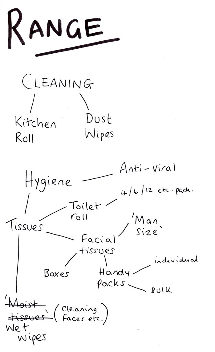
As I briefly touched on, on the first sheet and I mentioned in the crit, Kleenex have a range of products (mainly just tissues in different shape and size boxes) but I could propose that they had other products such as Kitchen towel, toilet roll (which I believe they already have in other countries), this would then give me a wider scope for development in terms of a range of products as I wouldn't be stuck to just producing a set of the same thing.
It was then suggested from this, that I could develop the 'word play' idea and try to validate womens nagging - or at least make it humorous instead of creating a campaign that is just moaning about men or pointing out what they 'don't do'; as my intention is to persuade men to use Kleenex more, not to annoy them.

When it came to the digital side of things, I was thinking of quite basic things, i.e. web banner. Taking into account the 'gadget head' side of men and the current technology lead world that we live in an the fact that my intention is to promote the product in 'un-traditional' places to reach the target audience, I need to consider this side more. It was made clear in the crit that we don't actually have to do the ideas that we come up with - we can propose the idea and develop the visuals for them like fascias etc., so really, this means we should be as creative as we possibly can be.

Lots of ideas...Need to get them down on paper.