Negotiated Brief

So, being that the negotiated brief for image is worth 50% of our grade - I wanted it to be something I would enjoy working on; I chose to base it on the 'Type as image' brief.

The only thing I knew I wanted to do was; Type as image based on song lyrics (like my postcards for the Book works brief, hense its kind of based on that too).

After talking through it with Amber...we decided I would do a series of poster, based on Lady Gaga lyrics (I can't exactly moan that there aren't enough visuals to draw inspiration from!)

So, this is my re-written brief;
And this beautiful piece of imagery was brought to my attention by Amber.
Creative genius! Maybe I should incorporate typogataeux? Or maybe not? :)

Signage - Finals

I printed all the signs on 6 different coloured pieces of paper because - it didn't cost anymore as I was already using 6 different colour and it meant that I then had 5 sets to chose from.

The images below were taken after I'd handed in the final ones, so the ones that are missing are the ones that I submit.

Signage - Variations

Doing them digitally made playing with layout and scale a lot easier.
I chose to make the lettering quite large so that it would be llegible from far away
I think reversing the text out works a lot better than a small outline...
however, just plain text is still quite boring...by adding diagonal lines it adds texture and makes them more visually engaging.
After deciding on the layout, I experimented with colour, however - rather than printing these on these in colour I think it would work better to print them using just black ink on coloured paper.

Below is the final piece that I will print on 6 different coloured pieces of paper -

Signage - My typeface.

After drawing up a few ideas and decided which one I wanted to do, I figured it was easier to vectorise a full alphabet and make the signs digitally rather than hand draw each seperate one and then digitise them.

(Hand drawn)
(Vectorised)

Book Works - The books

The book needs photographing better but before I sent them to the book fair, these are the photos that I took with the 10 final postcards that I chose...
Making 10 was...tiring, but it will save me time when it comes to birthdays!
For the book fair, I attached a red sharpie to the centre of the book, I think it made a nice piece!
I was really happy with it.


Book Works - Final things to print

I primarily did the variety of postcards using block colour on the text;

I then replaced the colour with patterns from the inside of envelopes. I chose this pattern to;
- Add texture to a flat postcard.
- Make them more visually engaging.
- Envelopes come in the post - postcards are sent in the post - its all relative!
- The colour was altered on the pattern so that the darkest shade of the pattern was the same as the block colour examples above.

(To be printed on Matt white card)
I decided to call the book 'I can't believe I didn't say this sooner' - another song lyric - because I thought it worked well with the idea of sending postcards.
I will print the following image on A4 - double sided (the left hand side is the cover, the riht hand side will be where I glue the cardboard to make the book), dove grey paper (similar grey to the colour printed on the postcard) and bind the book using this as the cover to be glued on.
...That isn't worded very well, but basically - this is cover.

Book Works - Hand rendered...

For the previous crit all the posters were digitally produced but I wanted to have a more hand-crafted feel too it.

I like them....but I'm not sure that it would make that much difference?

I used the 'Love love, kiss kiss' one to tryout other ways I could manipulate it with hand crafting.


By presenting them like this...I think the digital version looks better.
Above, I tried doing that quickly in digital but it...looked...Awful.
So I knew I didn't want to develop the idea of incorporating shapes into the type!

Book Works - Crit feedback

For the crit I did produce a book...it wasn't final, but I thought it was the best way to represent the idea that I was going for; A 'book box' with a series of postcards inside it - so it looks like a hardback book but its actually a box with postcards inside.

(For the crit I did actually have examples of postcards inside it)

Although the type on the postcards are based on song titles and song lyrics, I made a point of saying that I didn't want to make this clear in the set - so I would write the artists or anything on it, I would simply use the line.

Feedback;

Following on from the crit I will;
- Finalise my postcards.
- Think of name for the book.
- Final 10 pens or pencils to put in the book.
- Produce them!

Book Works - Decision making.

When writing my rationale, I knew I wanted to produce a book based on type and that it would be interactive in some way...

After design context research, I came to the decision that I would produce a book of postcards...

After a quick...spider diagram? (Not sure whats politcally correct anymore), I decided the type would be based on song titles and possibly lyrics, so I went through my itunes and wrote down a few lines that I would be appropriate -


Collaborative briefs - My boards.


(The uploaded images are A2 - 72dpi)

OUGD203 - Collaborative brief evaluation


As a designer, I never ‘look forward’ to collaborative briefs and leading up to it, I get extremely anxious. This collaborative brief wasn’t any different but now the deadline has been and gone, I am pleased with the work that we produced and I feel that the creative partnership worked well. In other collaborative partnerships I have followed the advice to not work with friends however in this instance I thought; if my friend has the design qualities I am looking for and I have never worked with them before, I’m never going to know whether it will or will not work.

As I stated on the original contract; ‘Nichola is commited to the course and is reliable so I know I can trust her.’ I’m glad to say that this stayed true and I felt confident working apart and meeting at set intervals to put our work together. Another point that I made on the contract was that ‘Nichola works well with type where I work better with image therefore I hope that putting our strengths together we can produce a successful piece’, we both worked on our strengths and when we were working alone, I’m sure were both happy with our work but when we came together it was hard to analyse each others; I don’t think this led to an unsuccessful piece but I do feel it made decision making take a little longer because, personally, I didn’t want to say something to upset Nichola so I ‘umm’ and ‘ahh’d’ a lot until I would suggest anything, even if it was a tiny decision where she’d ask me which typeface I liked; this was probably the biggest problem when it came to working with a friend, but on the other hand, we communicated a lot more than I ever have in any other collaborative brief.

Referring back to the contract and what we both wrote about design skills, I think we definately stuck to this; I stated that I wanted to work with image and a limited colour palette which I did get to do. Nichola mentioned her interest in typography which were needed throughout the brief, as well as her layout and InDesign skills. One particular area of the project that I felt we worked really well together on, was the research and we stated that this would be a joint responsibility; thankfully, this brief meant we could go on a ‘research trip’ to London; Nichola was ‘in charge’ of documenting it in terms of photography (with a good camera!), I had a little digital one, took notes and recorded all the info on our ‘interactive tickets’.

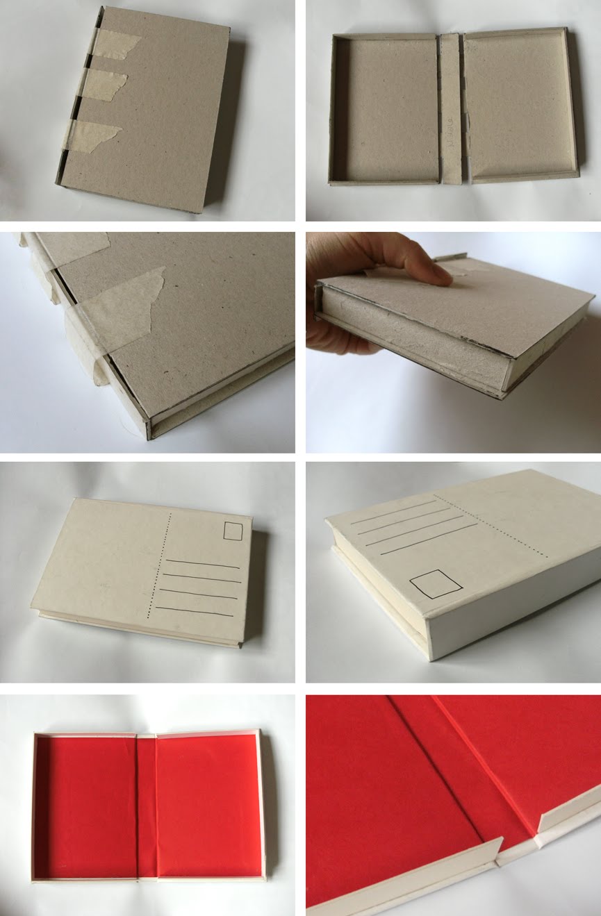
The final boards that we submit as a creative partnership to YCN were quite image dominated so when it comes to producing my own boards, I will document the development of the production of my images. In addition to this, I will show my own type work; this was Nichola’s area of the brief, and rightly so, because she is more skilled in this area as she did the type module and I did the image one, but I think it would be interesting to see how different it would have been if I was doing the brief on my own and I would have responsibility for the type aswell.

I stated on my creative partner ‘advert’ that I was ‘cooperative’. I don’t think that in this brief I was ‘uncooperative’ but I don’t think I could use that as one of my personal traits anymore; looking back on the brief, I do feel that I may have been a little overpowering sometimes and instead of discussing some things, I just said ‘I’ll do it’ and when it came to making images I produced them on my own and maybe forced the idea upon Nichola, at the time I didn’t do this intentionally and its not because I think I could do it any better than Nichola; I’m just a control freak.

Looking back on the creative partnership, I am happy with the work that we produced and I’m more than happy that I chose to work with Nichola. However, it has reinforced to me how much I like working alone; when I have to depend on other people or other people depend on me, I tend to panic, get very anxious and sometimes angry at the other person even when they haven’t done anything wrong. In the book ‘How to be a graphic designer without losing your soul’, the author explains that the freelance life suits two kinds of people; ‘the second type is best characterised as the creative loner. These are individuals who cannot be comfortably accomodated within the structure of a design group...They are often designers who cannot compromise their work.’

So overall, from this brief I have learnt that I am a control freak; a creative loner.

Too late...

Well, Me and Nichola decided that we couldn't think of an effective way to have an interactive billboard that could work in places where people couldn't physically interact with the poster etc.

And then.
Typical...Both me and Nichola walk through Leeds train station every day that we're at college but we never walk out the way where you walk past McDonalds and subway...and then, the day before we had to send off our YCN boards, I walked out that way and look what I saw...
A 'pop out' billboard that I know for a fact has been there for well over a year!
But hey, even though its too late for our collaborative brief...I thought i'd have a quick go with the idea anyway.
It would have looked better more exaggerated....with bigger gaps between the layers and maybe playing with angles like on the Xscape one.

I may work more on this idea for my boards...

YCN Boards

These are our final boards to send off to YCN.
We chose not to put a lot of text on them as we hoped that they communicated the 'British Music Experience concept and ideas' visually.


And just to prove that we printed them off...

Final Posters and Final Mock ups...

These are the final posters/layouts finalised by Nichola.
I think they work well as a series of posters; they all look alike but are technically different.


Using the final layouts and type choices, these are the final mock ups that I did for the presentation boards.


In terms of the mock ups, I'm really happy with them and think that, to an extent, they are convincing considering they are all done digitally.