This module has been somewhat of a test for me; it has been hard, tiring and it has taught me a lot but ultimately, I have really enjoyed it. It has really tested my motivation; this was a largely self directed and self written brief, it gave me the opportunity to produce work in an area that I wanted to explore further but on the other hand, it was a relatively long brief - around 6 weeks and at times, I found it difficult to motivate myself to do something that I had written.
This time last year for the design practice module, I didn’t work as hard as I should have done and I knew I hadn’t done as well as I had hoped and consequently it was my lowest grade of the year. Obviously, I didn’t want to do the same this year but, as identified in a tutorial early in the brief, I seemed to be taking a downhill slope towards the summer - exactly the same as I did last year. Thankfully, I pulled myself back up hill and produced work that I am proud of and confident with. The latter part of the module has shown me how much I can produce if I plan my time effectively, for example I booked into the digital print room quite early to print my final products off and not only did this mean I could have high quality prints, it meant that I had a personal deadline to get the work finished by; if I hadn’t done this I would have spent a lot longer or worked a lot slower and consequently, wouldn’t have got as much work produced to an acceptable quality. In contrast to this, I have seen what can happen when I don’t manage time effectively because I didn’t make a booking to print my final presentation boards off so I had to print them on the laser printers on 2 A3 sheets per board, as a result of this, I was disappointed in the quality; the images are discoloured, the stock has bubbled as I prepared them a day before hand in and the join in the middle can be quite distracting. Therefore is something I definately won’t do next time; I intend to make bookings weeks in advance if necessary.
As mentioned previously, this brief gave me the chance to work with something that I wanted to develop; it wasn’t particularly a practical skill like print making or software skills, it was focusing on illustration and type/type as image, I wanted to produce a lot of the initial work off screen, therefore I spent a lot of time drawing, as apposed to just manipulating type on screen, which has made me realise how much I missed doing that.
In a few of the progress surgeries, it was mentioned that I seem to be developing a ‘style’, this wasn’t really my intention; I don’t see this as a negative but I don’t want this to limit my work in the next year.
I also drew on my experience from the ‘design for screen’ module to assist me with the digital distribution aspect of the brief; in terms of storyboarding and testing; I didn’t factor enough time into my timetables to produce high end quality pieces but I did produc animated proposals for what the pieces could look like; I was content with this, I just wish they were of a higher standard. I created one vector animation but I also did two short image sequences, using my own photographs, which I hadn’t really done before; once again, these weren’t a very high standard but it gave me a basic idea of how to do it and if I have the oppurtunity to work in this way again, I will feel a lot more comfortable going into it and now know what needs to be planned before hand i.e. somewhere with consistant lighting.
It was indentified in the final crit that I ‘got my initial idea and just went with it’. I don’t think this is particularly negative because for me specifically, I can spend a lot of time forcing myself to think of different initial ideas and then I don’t spend enough time actually designing, whereas this time, I knew what I wanted to do and spent a lot more time designing and for that reason, ended up with a lot more design variations - all based upon type as image, but they all looked quite different and focusing on type as image was my intention for this brief.
I feel my biggest weakness in this module was experimentation; I am very happy with the products I produced and I do believe that, even if I had experimented more I would have still used the same stocks etc. but I should really have done more in terms of different stocks. I wanted to try different printing methods but I never feel motivated enough to learnt how to do it; in all honesty, I would prefer to spend all of my time designing, rather than spend a day in the print rooms, but I am quite a control freak so maybe once I realise that this would give me full control over what I am printing, I would feel more motivated. It is possibly something I would like to at least try in the third year, especially printing onto t-shirts.
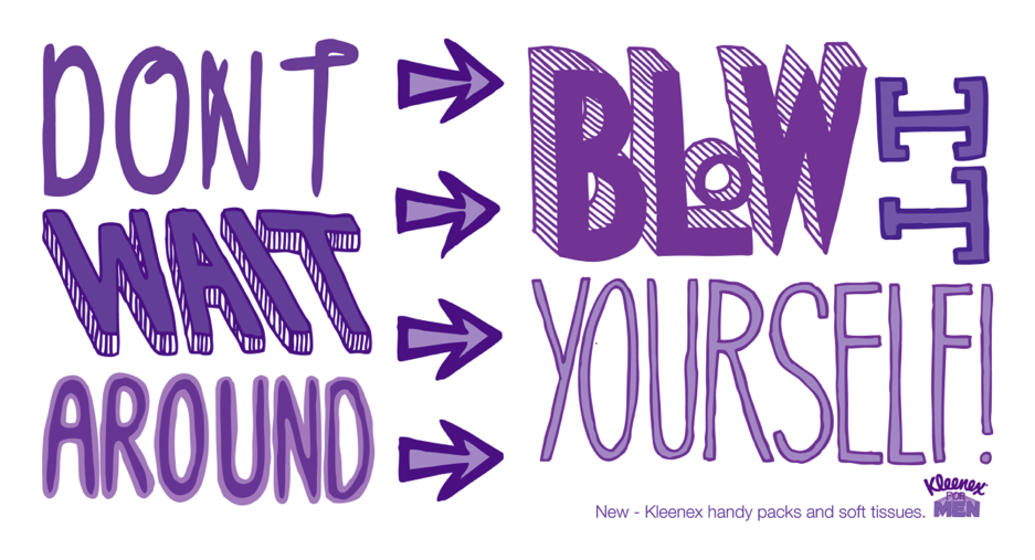
The aim of this module was to produce a product, a range and the distribution for that. I feel that I covered all areas of the brief to an acceptable standard; I believe my product is the type, the range is what I applied it to - tissue boxes, kitchen roll, toilet roll and ‘handy sized’ packs of tissues and I covered distribution both digitally and printed. I really like my products but there are aspects of it that I would change, for example the stock that I printed on wasn’t 100% transparent acetate, so I had to print onto a certain side for the colours to be as vivid as I wanted them to be; the smaller handy sized packs, the ink on the inside so the colours aren’t as bright but the red and green tissue boxed where the ink is on the outside, that side of the stock has quite a ‘sticky’ texture so the tangible nature of the product is quite let down by this.

Final boards
 * I ended up having to print them on the laser printers...on 2 A3's.
 Having left them in my folder overnight, they bubbled
up - Extremely annoying, but the content is still there.


Initial board mock ups...
These are primary mock ups of some of my boards that I will be taking along to the final crit -
1; Colour variations.
 2; Mock ups/development.
 3; Range.

 4; Print distribution.
 5; Digital distribution


* General feedback was to have less images and more type, but don't let the type over power the imagery - Less is more!
I still need to mock up my first board with Initial concept/audience on, and then possibly another one with initial drawings on but I'm not sure yet as that may mean I end up with way too many boards.
1; Colour variations.
 2; Mock ups/development.
This is one of the boards I wasn't too sure about...I like it and it does show development in my work but other people may disagree.
 3; Range.
 4; Print distribution.
 5; Digital distribution

* General feedback was to have less images and more type, but don't let the type over power the imagery - Less is more!
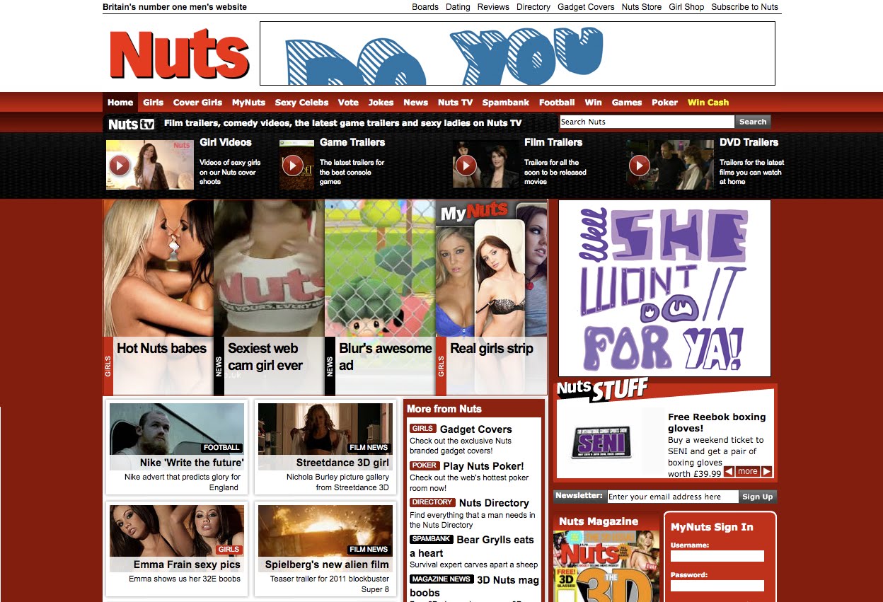
Print distribution - In context.
Magazines;


London phonebox;

Adshell;

Tube station;

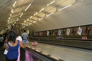
Billboards;

Stickers;
Could be given out with packs of tissues and it would give
the consumer the oppurtunity to post the stickers
anywhere they want.


London phonebox;

Adshell;

Tube station;


Billboards;

Stickers;
Could be given out with packs of tissues and it would give
the consumer the oppurtunity to post the stickers
anywhere they want.


Digital distribution 3


These were intended to be quite subtle forms of promotion - the facebook page is just something people might 'like', as they do with many other things, but then they could get notifications about new products and the latter example shows a small section on the existing Kleenex website that would just show the additional products aimed at men.
Personally I think they work quite well and fit in great with the rest of the site.
Web banners


In retrospect, I think I should have spent more time on this as the web banner may not read very well, unless the audience stays at the top of the page.
The square web ad would hold the 'purple' animation seen on another post, and I think this would work fine.
Although I like the web banner at the top, it could have maybe fit better on a different site/sized web ad.
After effects proposed animation
I have done one of the animations that I proposed with a storyboard - it isn't particularly as successful as I'd hoped but I will submit this as a proposal for what the final animation could look like - I should have given myself more time to work on it.
In certain contexts I think it would work quite well...I don't think it would work great on TV as an advertisement, but somewhere like picadilly circus where there is no sound...and you need to catch peoples attention I think it could be quite effective.
Below is a mock up, using one of my photos from Picadilly Circus and the axis on after effects...to show how it could look in context.


Stop motion...with sound.
I'm not overwhelmingly happy with the music choices...well, I'm relatively happy with the red box using 'The Cure - Boys don't cry' because I think it feels quite well with the subject.
The first one, with the green box is 'Bayside - No one understands', its supposed to relate to the idea of man flu and that they think nobody else has felt the same way...but I don't think the message comes across at all so I need to re-think this.
In context;


Subscribe to:
Posts (Atom)