More for the poster

I emailed the guy who has set up the competition or the guy that we need to send the entries to to ask him if they wanted a particular size...he just said 'Any A size'...so I'm working to A3 and hoping that that they don't want it any bigger.

If it did get chosen and they wanted it bigger...the main components are vectorised and I have just been laying it out on photoshop so if worst comes to worst...I will just have to relay it out on a bigger size.

I started with an image of the lead singer of the Cancer Bats but I thought...that would be a little boring to just have a straight forward illustration of him and it wouldn't be very 'halloweeny', so I added a little twist but changing his head/face to a skull.


Obviously I need to add all the details of the show and the 'Slam dunk halloween special' but at the moment in time, I'm really happy with how its going and I think the texture on the background works quite well.

The Cockpit competition...

I've gone to The Cockpit to see bands since I was about 13, so when I saw the poster competition I thought...why not!

I chose to the Halloween special with Cancer Bats because I like the band and I thought I could focus the content more towards what I like.

I started simply with the band name...I used their existing logo but I couldn't find a very high resolution image so I had to re-draw it and vectorise it.

And to make it a bit more 'halloweeny' I thought I'd just add a bit...

Manchester Book Fair

Before I can start this brief, I obviously need the actual quotes that I am going to be working with.
I have gone through the past 3 weeks of OK magazines interviews with Chantelle and Preston and picked out quotes.

The series of quotes don't necessarily have a narrative, they are simply a collection of phrases from one source that I think could be visually interpreted in an effective way.

Once I have made a final decision on the format, I will then know exactly how many quotes I need but for now I have just listed my favourites;

- 'At the time, it was easy to be angry.'

- 'It just didn't work out.'

- 'I didn't take it well at all.'

- 'We were so stupidly happy.'

- 'I like having that in my life again.'

- 'Sometimes you just have to do what your heart tells you.'

- 'Sometimes you have to put your heart on the line and accept that it might get broken.'

- 'It was too much too young.'

- 'It felt like such a victory.'

- 'We're hopeless romantics who falls in love easily.'

- 'Its very difficult not to fall in love with her.'

- 'My love life is a bit of train wreck right now.'

- 'We ran with it and we fell over.'

- 'Until the day we die.'

- 'Its our hearts on the firing line.'

So, I have 15 quotes there and for the initial ideas that I have, I expect that will plenty.

Now I can get drawing!

Briefs and Proposal


(Not sure why there is a blank page in the middle? But nevermind)

T-shirt mock ups

Instead of doing what I usually do - spend ages researching, spend another while designing and then put it all together at the last minute, I thought I would mock up as I was going along.

As this is such an early stage in the design process, I can't see these being completely final designs but for initial mock ups I think they work quite well and show that I was inspired by 'old metal tees' (mainly iron maiden ones.)


I think by just making the image looks slightly worn away it gives the image more texture and looks more 'vintage' inspired...although I may have worn a little too much away!

Criminal Damage...

After i'd thought of 2 ideas for the Criminal damage brief, I was at a bit of a loss...so I went back to (what should have been) step 1...just noting down visual inspiration.

Thankfully I have more ideas now...

Initial ideas

After reading the columns and getting a 'jist' of them, I sketched a few ideas.
I didn't spend a long time sketching out ideas or thinking of lots of them because editorial briefs are generally a quick turn around thing.

This is what I will do for the rest of the weeks too...

'This column will change your life'

1. A cross section of a house with very little in it.
2. Traveller with bulging pockets - illustrating the man who aimed to travel with only the things he could carry in his pockets.
3. Toilet - flushing away the things we use everyday but don't particularly Need.

'Diary of a disappointing order'
I picked up on the phrase 'Everyone is on their fruit phones' so I just illustrated it literally.

The Guardian - 02/10/10


Skull/Water

Skulls was something that appeared over and over in the visual research and it is a generic thing that the brand knows will work on their t-shirts.
I don't think skulls are particularly overused because they can be used in so many ways so I wasn't going to avoid using a skull, because I like the image of them.

I then incorporated an open mouth skull with vintage/hawaiian tattoo style waves.

It still needs work, particularly on the waves and it needs vectorising but once again - I haven't really done anything like this before so I am happy with it.

2 drawings done and I already see my design direction going the way I want it to, good good.

Hula/Hawaiin pin up

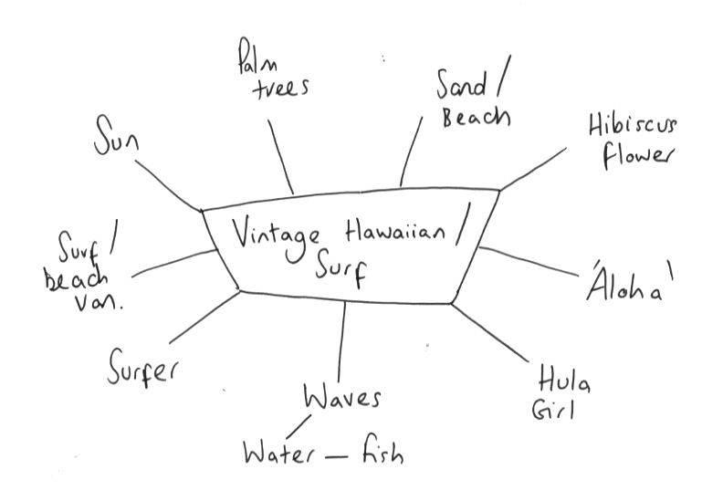
After doing some visual research into the themes, and looking at various hawaiian imagery I liked the visual aspect of a hula girl - more specifically, a hula pin up girl because I really like old pin up style illustrations.

It wouldn't have been very criminal damage if I just frew a straight forward pin up girl, so taking into account the 'quirky criminal damage twist' I chose to make her a zombie/tattooed hula pin up.

This was really something new for me because before, my illustrations have been quite basic in the content - they were all based on an existing image i.e. photograph or object. Therefore, to justify this as being my own work I couldn't find an image of a zombie hula pin up girl with tattoos because...it would be copying. So I did have to imagine some of it.

To get the proportions and position right, I just base my drawing on an old hawaiian pin up girl illustration (in retrospect, I wish I had used a generic pin up so that I didn't end up copying the hula skirt.) I then added...and substracted 'bits'.

When vectorising it, the main thing I didn't want to do was just use a standard 1pt stroke and then colour it in - so the outline is a shape in its self so that I could get different thicknesses around to add more depth and I just think it generally looks better (again, this is something new for me - in the past my illustrator have either been live traced or a 1 line stroke.)

Also, I haven't vectorised all the tattoos yet and she didn't have the criminal damage type on her leg on the original but after some development I thought this was a simple way of incorporating the brand name without needed anything else - however, if there is other type on the final composition I can simply remove the type and replace it with the other tattoo.

Same as the typefaces - none of these are set colourways, it was just a case of experimenting.
Up until this point...apart from the white eyes and the missing foot, it wasn't clear that she was supposed to be a zombie of some sort. With my wacom tablet I just added some shading a few bits of 'bloog' - I definately think this makes the image clearer.


The image does need more work (i.e. the grass skirt wasn't vectorised properly and it needs more gory detail on the face) - considering this is the first time I have illustrated something like this, I am really happy with it...which in itself is rare for me!

Criminal Damage type 3

I did the piece below to go along with the hawaiian/surf theme that I was advised to look at - initially, I don't think this ones works very well (hense the reason I didn't vectorise it), however, I do like the incorporation of hibiscus flowers with the type to represent the hawaiian/surf culture.

Criminal Damage type 2

The typeface below is partly influenced by Metallica, with the two enlarged letterforms at each end, and partly by Megadeth for the sharp serifs.

When I initially drew it, I mis-judged the sizing so I had to add an exclamation mark at the end of 'damage' to fill the space - once I vectorised it, I could remove it thankfully.


At the moment I haven't added the final outline around the text, but I wanted to experiment with it at this stage to see which of the two would work better.

If I choose to pursue this style of type I firstly need to address the D - it doesn't work with the other letterforms and looks too small.

The Megadeth type looks kind of 3D/metal (for some reason it won't let me upload an image of it). Taking this into acount I tried a similar effect on my type - it looks a lot more crisp that the image of the Megadeth one that I have. I'm not sure if thats a good thing because it brings it up to date, or a bad thing because it doesn't look vintage.
In contrast to the metallic/3D one, I use a similar effect to the vintage looking Iron Maiden inspired type. I think with a few alterations (the D in particular), the red one could work really well.

Criminal Damage type 1

After looking at some of the visual inspiration that the brand gave me, I initially started sketching type ideas based on type from vintage metal t-shirts.

Obviously the one below is based on Iron Maidens typeface.
I like the letterforms, I'm just not sure if the two seperate words work well together.


After vectorising them I tried a few different colours, none of these are what I see as being a final colourway or layout, its just experimentation.
Although I like the initial text - the block colour just didn't look right, so I tried to make them look more washed out or 'vintage' (in terms of quality) and I think they look immediatly better.
I prefer the ones below, without the black outline. The black outline looks too thick and cheap whereas by simply taking this away, I think the type looks better quality.