When I say I am surprised how helpful I am finding these workshops, I don't mean that in a bad way because I knew they would be helpful but I have literally never taken so many notes in a set of workshops, they not only have taught me about designing for print on the mac, they have also made me love colour more...
During the first workshop, focusing on illustrator, when we were given the time to experiment with tints and transparencies, I did this:
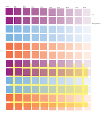
It is quite a quick example but I think it shows how you can uses tints and transparents to create more colours and save money. Plus, I think it looks nice :)
Photoshop workshop: Duotone.
I didn't previously know how to do this, so I was definately glad to find that out.


No comments:
Post a Comment